
This assignment in David Hornung's book Color: A Workshop for Artists and Designers is to make one color look like two. The Inkpad app on my Ipad is perfect for this. It's really easy to make a template with two big squares and two small ones and then just copy it for each new attempt. By setting the color to HSB, I can select a square, either the small middle one or the large outside one, and play with individual sliders to change one of the three parameters used to describe any given color: the Hue (color, as in red, blue, etc.), Saturation (whether the color is pure or diluted), or Brightness (light or dark, same as value).
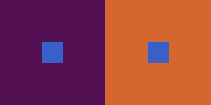
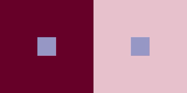
The first part of the exercise requires making one color look like two by varying the value, or brightness. So the two small squares in the examples above are both the same color, but the surrounding color makes one square look lighter or darker than the other.
When all that's required is make one color look lighter or darker than the other, I don't really think it's that hard to do. But the next step is to make one color look like two by changing the hue. This is not nearly as easy, as I've already discovered after a few hours of trying. You'll have to judge whether I manage to do it when I post the next series.
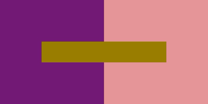
Just in case you didn't believe me that the two small squares are the same color, here's the proof. (Although it looks that way, you'll have to trust me that the middle bar is one flat color and not a gradient.)